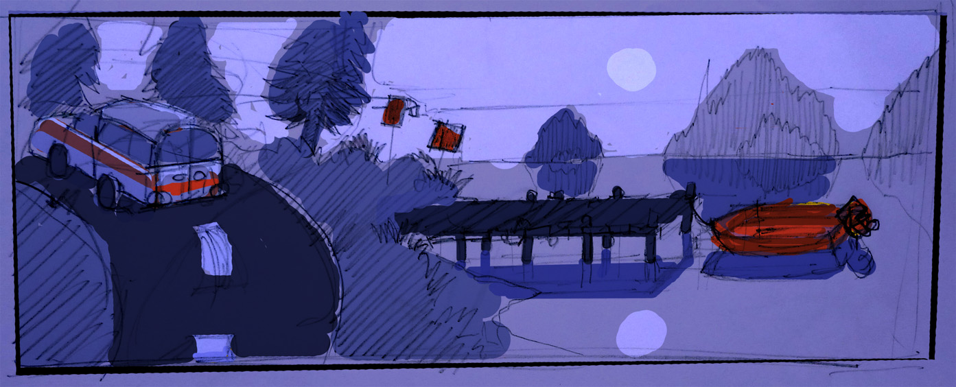
During user testing we’ve come to realise that players have a hard time finding out which objects can be interacted with and which can’t. The iDevices don’t have mouseover, so players usually just tap any object which they think is even remotely interactable. This adds up to an awful lot of fruitless tapping, which in our opinion disturbs the game flow. Still, we want the background to have a high level of detail so the problem arises: How do we put in highly detailed graphical objects without the player perceiving them as interactable objects?
We’ve tried having interactible objects sparkling occasionally, which most user testers find to be a great help. Still, some testers are annoyed by this solution as they’d rather discover the interactable objects themselves.
Using Colours
We’re currently working on using colours to solve the problem. The idea is to have a general palette for the background and then highlight objects with colours outside that palette. The idea comes from EA’s Mirrors Edge which uses a similar colour system to guide the player.
Above is a sketch of a game scene taking place next to a lake at nightfall. To the left is an ambulance parked by the roadside and in the middle there’s a mailbox, a sign and a bridge leading to the small boat on the right. The colour scheme should make it pretty clear which objects are interactable: the ambulance, the mailbox, the sign and the boat.
Will it work? Only loads of user testing will tell…


